
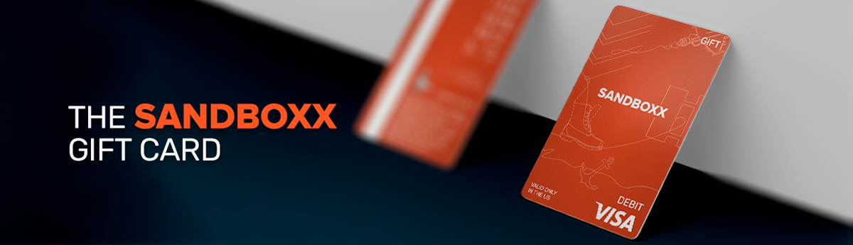
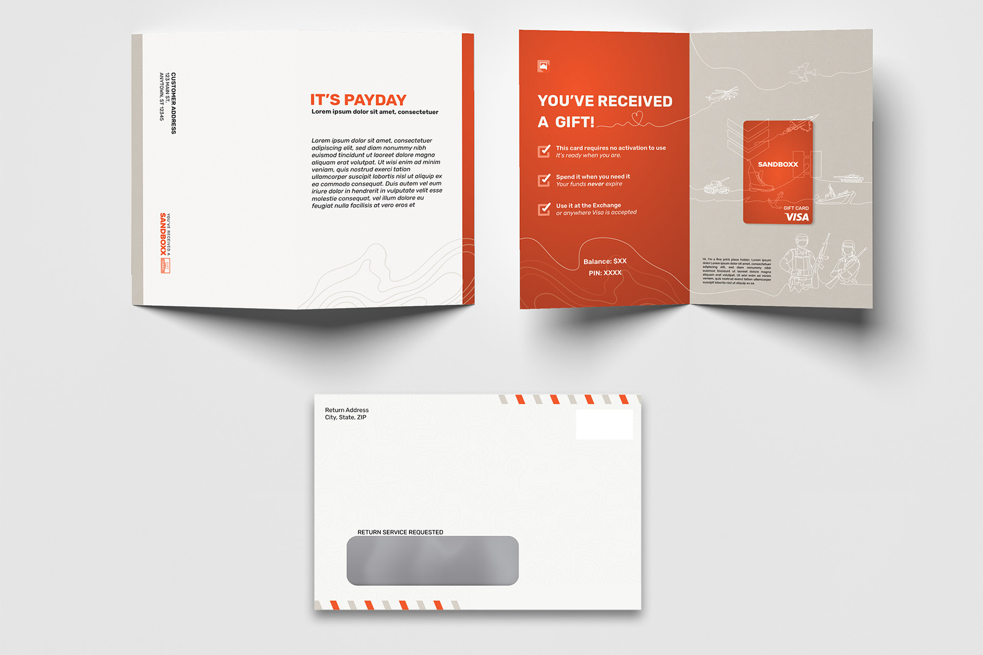
The Sandboxx Gift Card was created so that supporters could send a military-centric gift card to their loved ones serving in the military.
I looked at this project as a practice in brand visibility and recognition. How could we build something that was really just a COOL card, but also screamed SANDBOXX?
Credit card and gift card design is tough. You have a very small space. You have a lot of rules. And you have elements that MUST be present. Most cards you see fall back on using a textured and colorful background to provide some unique visual indicator that ties to their brand and sets it apart from other cards.
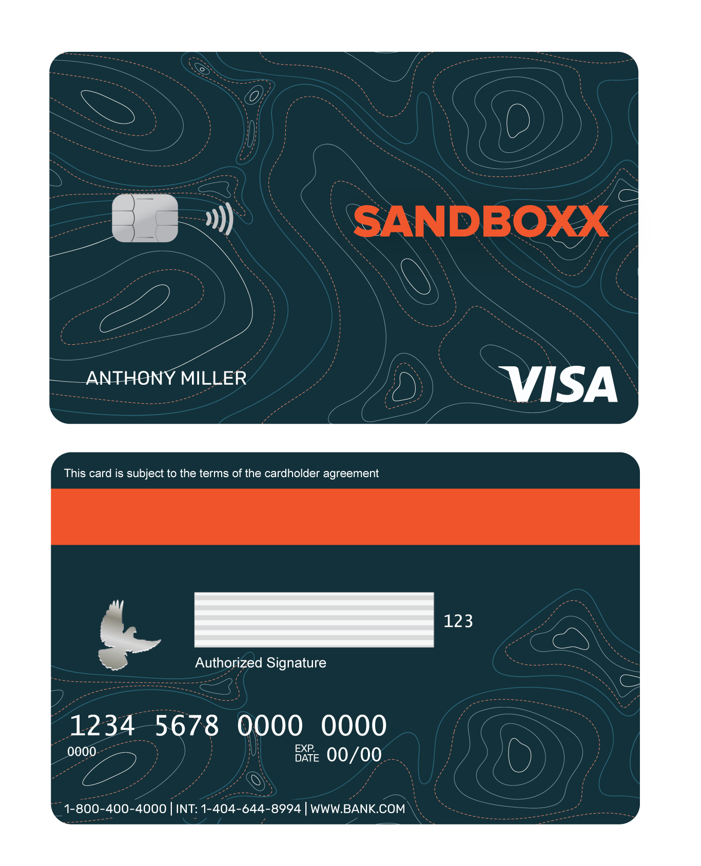
Though there was a lot of love initially for a blue card that boasted a modernized version of the companies topographic background, the Sandboxx brand main color, Mission Orange, was really the best direction to go to foster brand recognition.
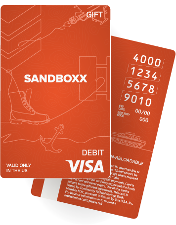
Using some stock line art from Adobe and editing it to flow together to form a visual narrative that could speak to each service, I created an illustrative background that, as cleanly as possible, represented the land, sea and air services as well as the officer and enlisted corps.