Potter's Cabin
Logo Development for a rental in the woods
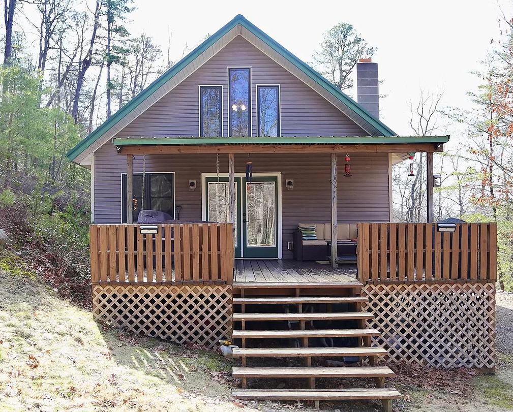
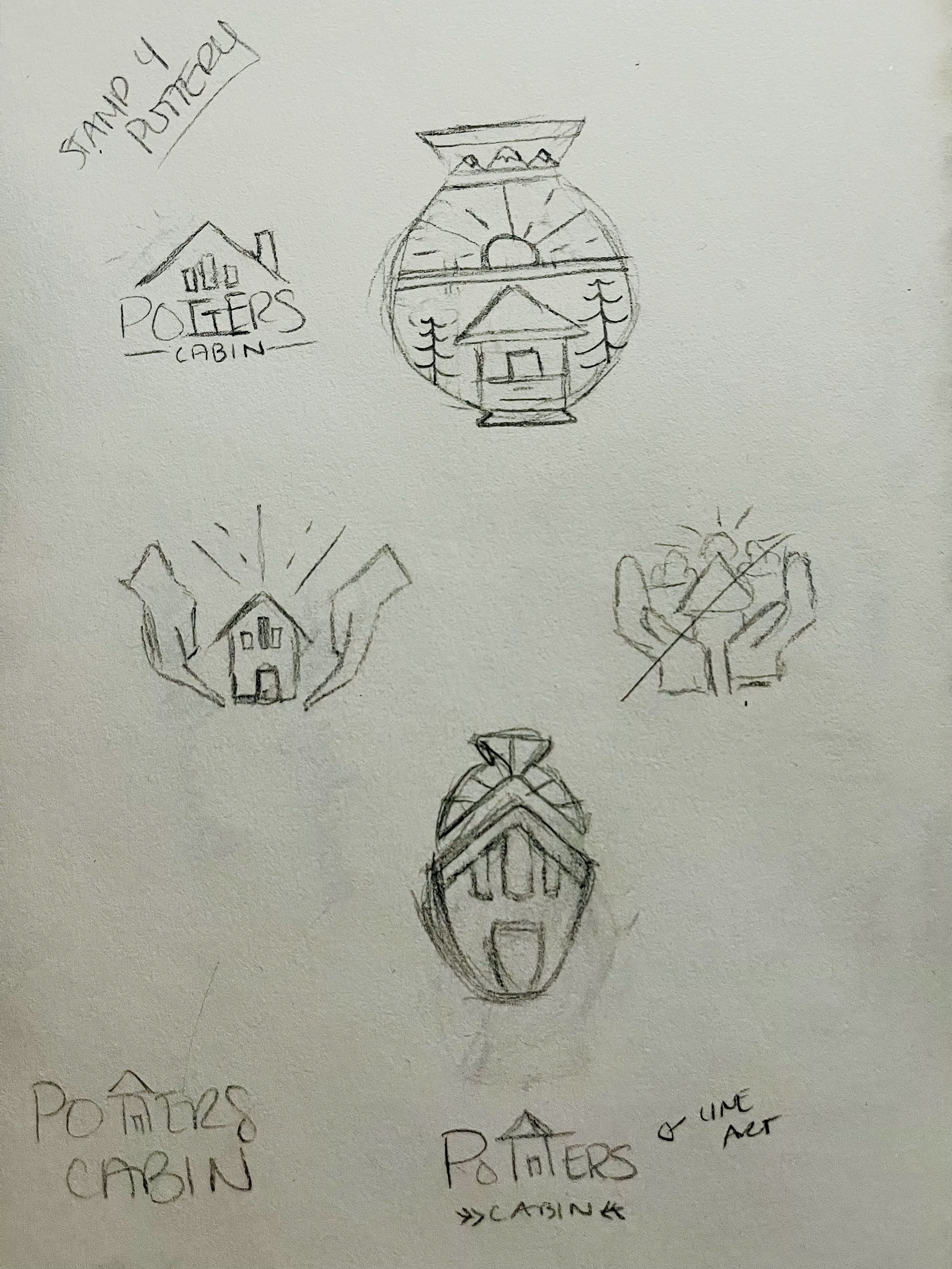
After viewing some photos of the home and reading through the client's initial questionnaire on their vision, I sketched up a few ideas to digitally draft. The home sits near a lake in the woods and inside will showcase the work of one of the owners who crafts some beautiful pottery. Their initial vision from the client brief was the words, "Potter's Cabin" framed within the frame of the home. While I provided them some different options, seen below, we ultimately went with something very similar to their initial vision.
It should be noted that they wanted something not only for general branding, but also to use as a pottery stamp for the bottom of their work.
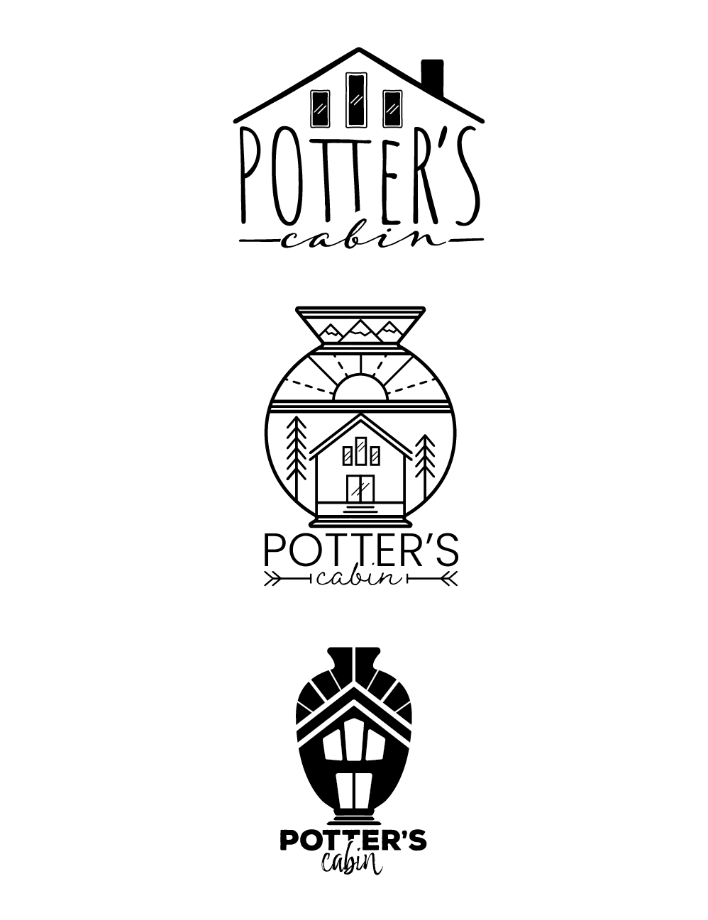
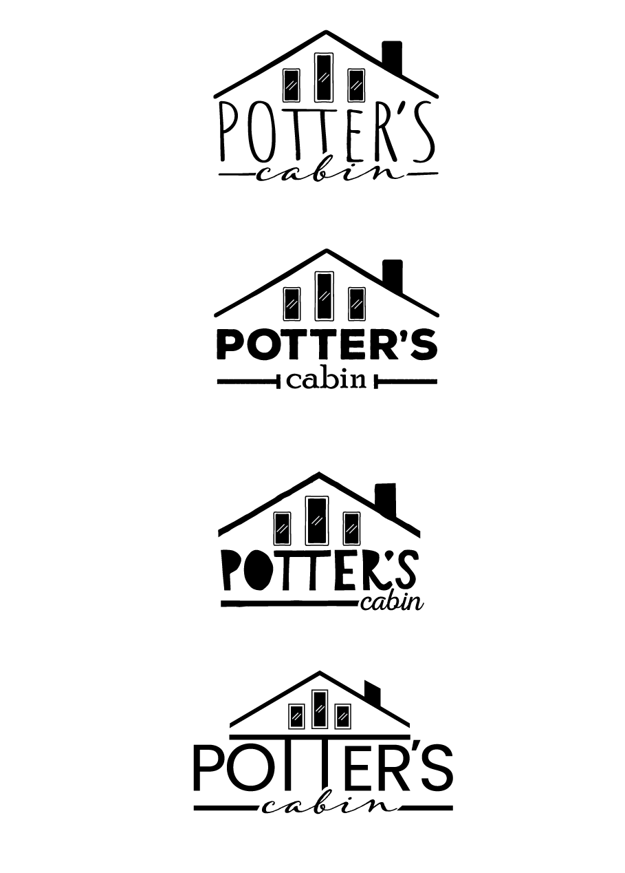
The first group of sketches to the left were my initial deliverables to the client. The really liked the first draft with the roofline but asked for typography variations, liking the "Potter's" font (Amatic) but feeling like it was a bit too tall.
I provided variations (to the right, above) with the first one using the same font, but with some manipulation. Some of the other typefaces used above required some rework of the roofline to better match the edgework of the fonts used.
They came back to the original font, but really liked the roofline edge made by the "TT's" in the last treatment so I worked to carry that over into their next round of edits.
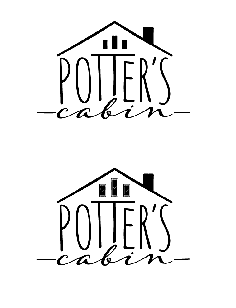
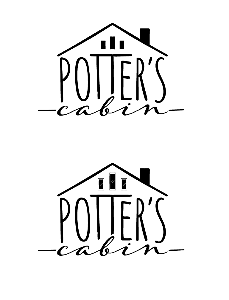
I worked to center the roofline under the 3 windows and continued to fine tune the line work of "Potter's" to better integrate within the shape of the roof and with "cabin" below. From there, as you can see to the right, I thickened the lines around "Potter's" to be more visible. This was per the clients request, and was definitely warranted.
I also provided a version with shiny windows (bottom logos) and a version with simplified windows (top logos) for smaller projects, like the potter stamp.
I wanted to note here that I used this font (Adorn Garland) for "cabin" for a variety of reasons (weight, flow) to include that fact that I felt it was reminiscent of a water line, which to me, spoke to the near by lakefront.
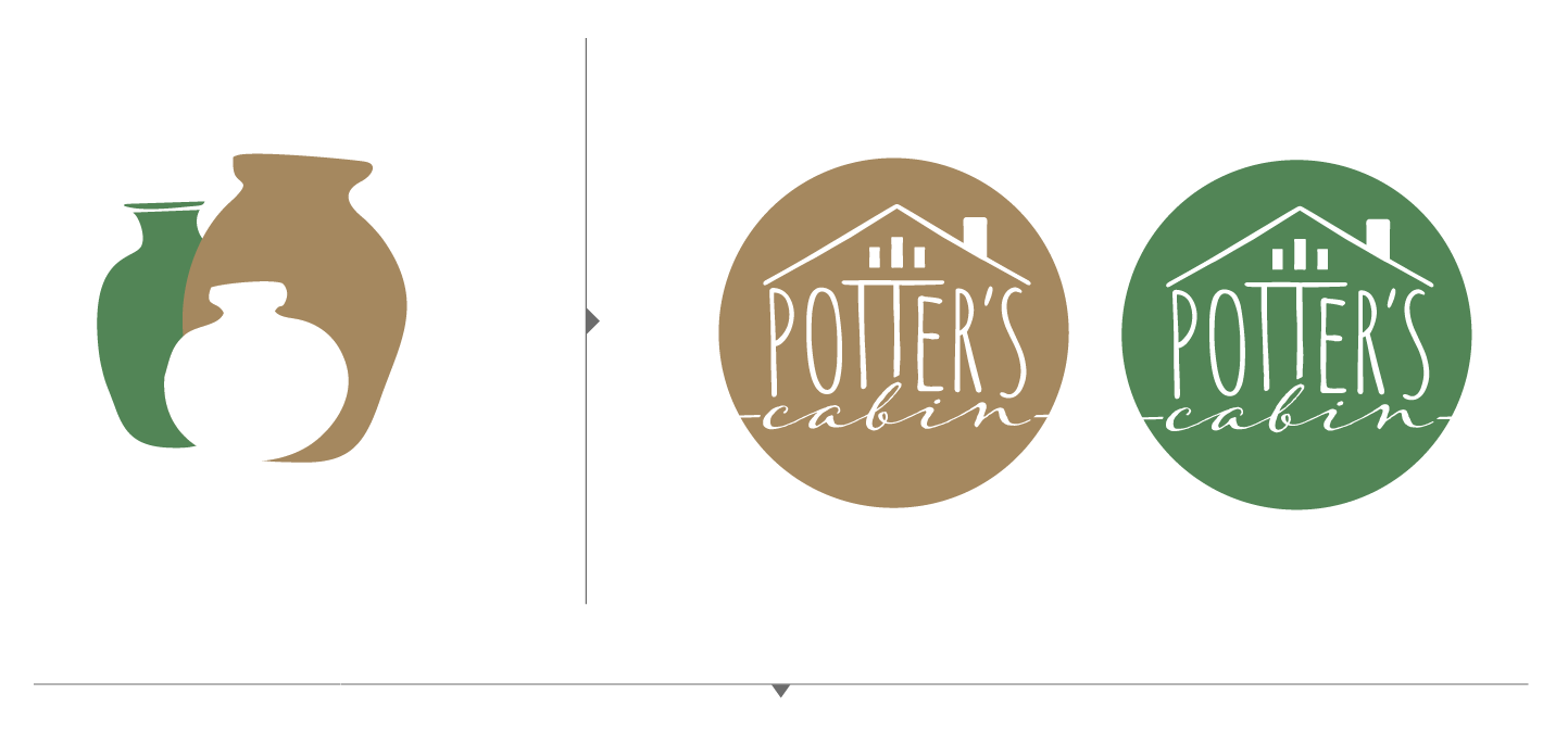
The color scheme was to be similar to the colors of the cabin - browns with green trim. We went through a couple rounds before we settled on the colors above. With that I provided a couple of simplified, single color options.
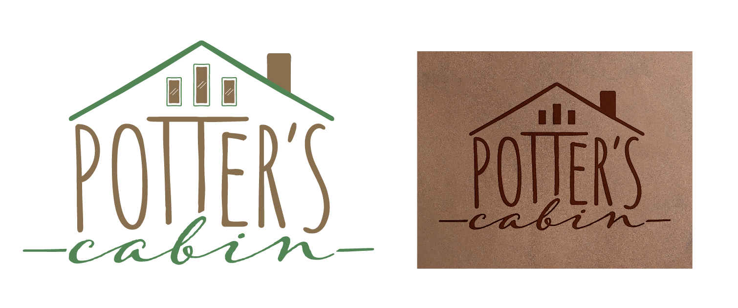
The final full logo can be seen above with a mockup of a stamp version on top of a pottery texture to give the client an idea of what the simplified logo could look like stamped on the bottom of their pottery.
