Big Blue Getaway on the Bay
Logo Development for a beach rental
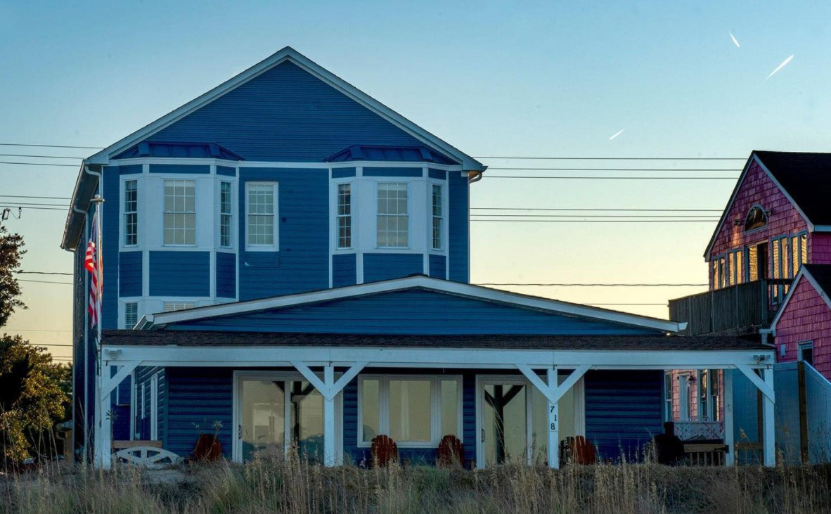
Following some initial sketches based upon the clients original request, I received some extra photos of the rental location from the client that steered my digital thumbnails in a different direction. Courtesy photo above of home from client.
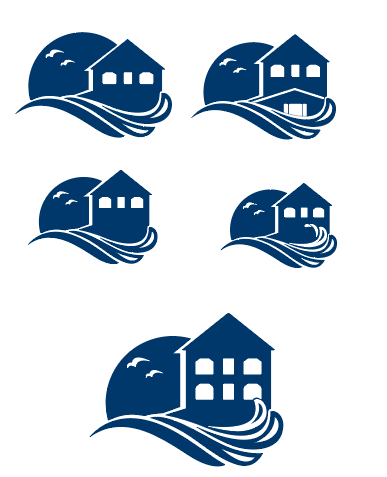
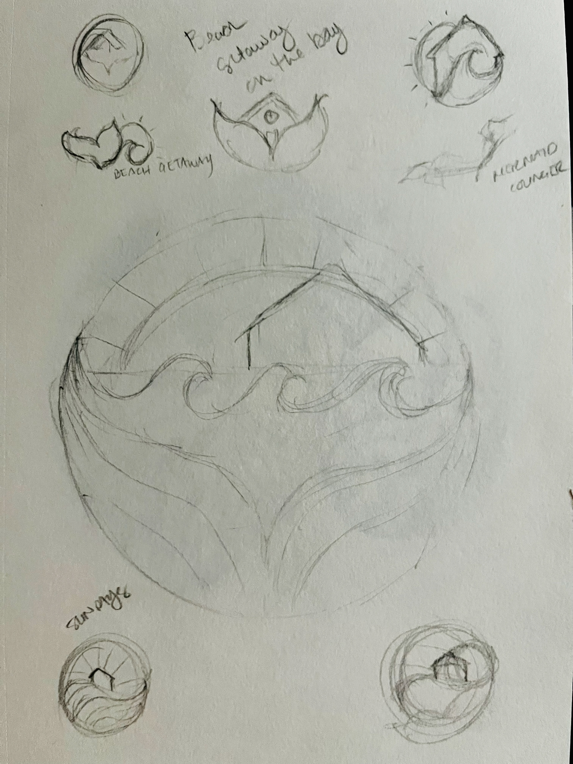
The first group of sketches to the left were my initial deliverables to the client. The really liked the 3rd one but asked that the house be taller. They really wanted to better visualize HOW BIG the house is.
To really get an accurate feel for how clients feel about the logo mark, I usually start in single color. This allows the client to get a better feel for the logo without letting their feelings for my color choices get in the way.
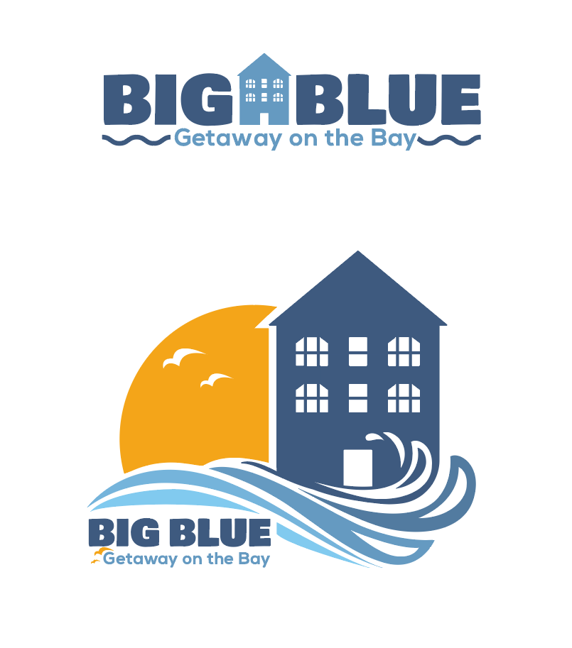
The final was taller, and thinner (to add some extra appearance of height.) With some finessing of the waves and the addition of window panes, we had our logo mark.
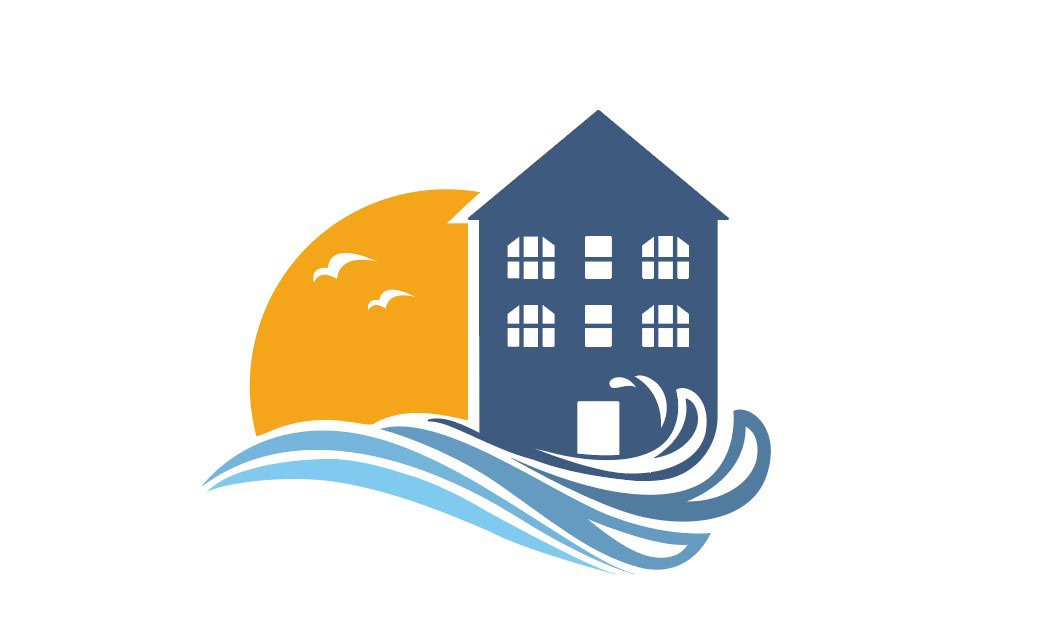
The color scheme, of course, had to be based in blues. I did a graduated blue from the waves to the house and added the orange sun as a balanced contrast.

After getting the logo where they wanted it, next came the typography. This didn't go through many edits - the most notable one was that I had originally chosen a different house to go between 'Big' and 'Blue'. It aligned well with the type, but ultimately here, the client was right and we went with the house from the logo mark.